
A Brand Built
Around Questions
Translating the language of journalism into a bold, recognizable visual identity for independent reporting.
- Brand
- WhoWhatWhy
- Role
- Creative Director
CMO - Discipline
- Brand Strategy · Visual Identity · Editorial Design
- Period
- 2018–2021
01The Challenge
More than delivering information
Independent journalism depends on more than delivering information. It depends on asking the questions that reveal context, challenge assumptions, and encourage deeper understanding.
The creative challenge was to establish a recognizable identity that could communicate this editorial purpose while providing a consistent visual framework across digital publishing, communications, and audience engagement.
02The Creative Idea

The Power
of Context
In writing, brackets introduce context. They clarify meaning, add perspective, and draw attention to information that might otherwise be overlooked.
That simple editorial convention became the foundation of the WhoWhatWhy visual identity.
Paired with an assertive typographic wordmark, the red bracket device created a distinctive visual language that could frame stories, emphasize ideas, and establish continuity across a wide range of editorial content.
The Thinking Behind the Identity
The WhoWhatWhy identity grew from a simple idea: journalism should ask better questions, uncover context, and make complex information clearer. That editorial philosophy informed a distinctive visual language built around bold typography, a graphic bracket, and a disciplined black, white, and red palette.
03From Identity to System
Designed to Adapt
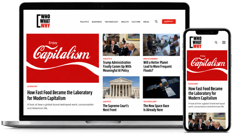
The strength of the identity was its adaptability. A consistent typographic and graphic language provided recognizable brand continuity while allowing individual stories to retain their own character.
Rather than relying on a rigid visual formula, the system established a set of principles that could be applied across different formats, subjects, and communications.
04Brand in Action
One Identity. Many Stories.
INVESTIGATIONA SYSTEM IN THE SHADOWS


THE NEXT
FRONTIER

REAL STORIES.
BIGGER
QUESTIONS.
— PODCAST —
THE HUMAN
COST
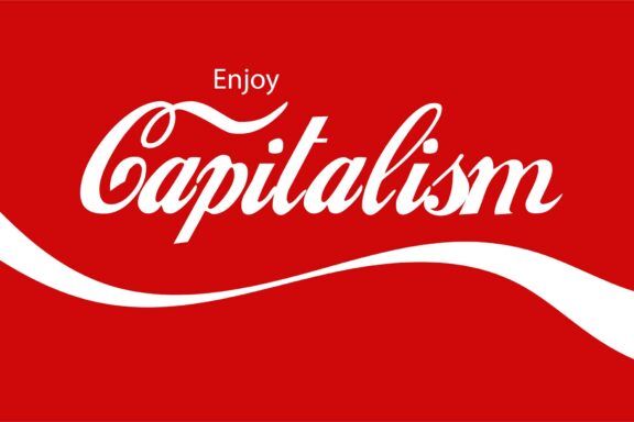
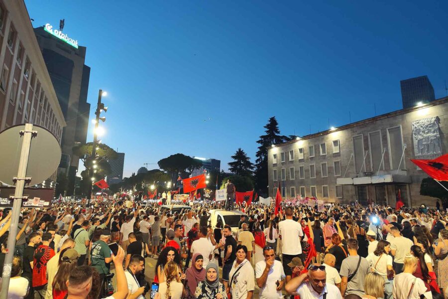
Selected applications reconstructed to illustrate the original creative direction.
05Creative Leadership
From Creative Direction to Marketing Leadership
What began as a creative leadership engagement evolved into a broader strategic role. Initially responsible for transforming WhoWhatWhy’s visual identity and digital presence, I subsequently assumed responsibility for marketing strategy, outreach, and communications, ultimately serving as Chief Marketing Officer.
This evolution connected brand expression with organizational strategy, establishing a more cohesive approach to how WhoWhatWhy presented its mission, engaged audiences, and communicated its editorial purpose.

An identity designed to ask more, reveal more, and communicate with clarity.