BRAND EXPERIENCE · CREATIVE DIRECTION · RETAIL
Citizen
Precision as a brand language.
Creative Direction · Retail Brand Experience · Integrated Marketing · Print & Digital Production
The Role
Independent Creative Director
Citizen Watch Group · March 2023–Present
The Work
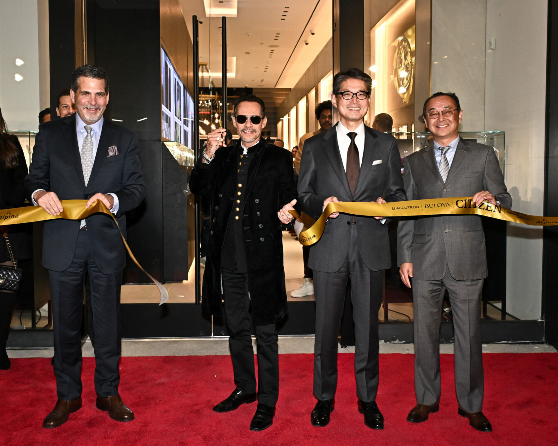
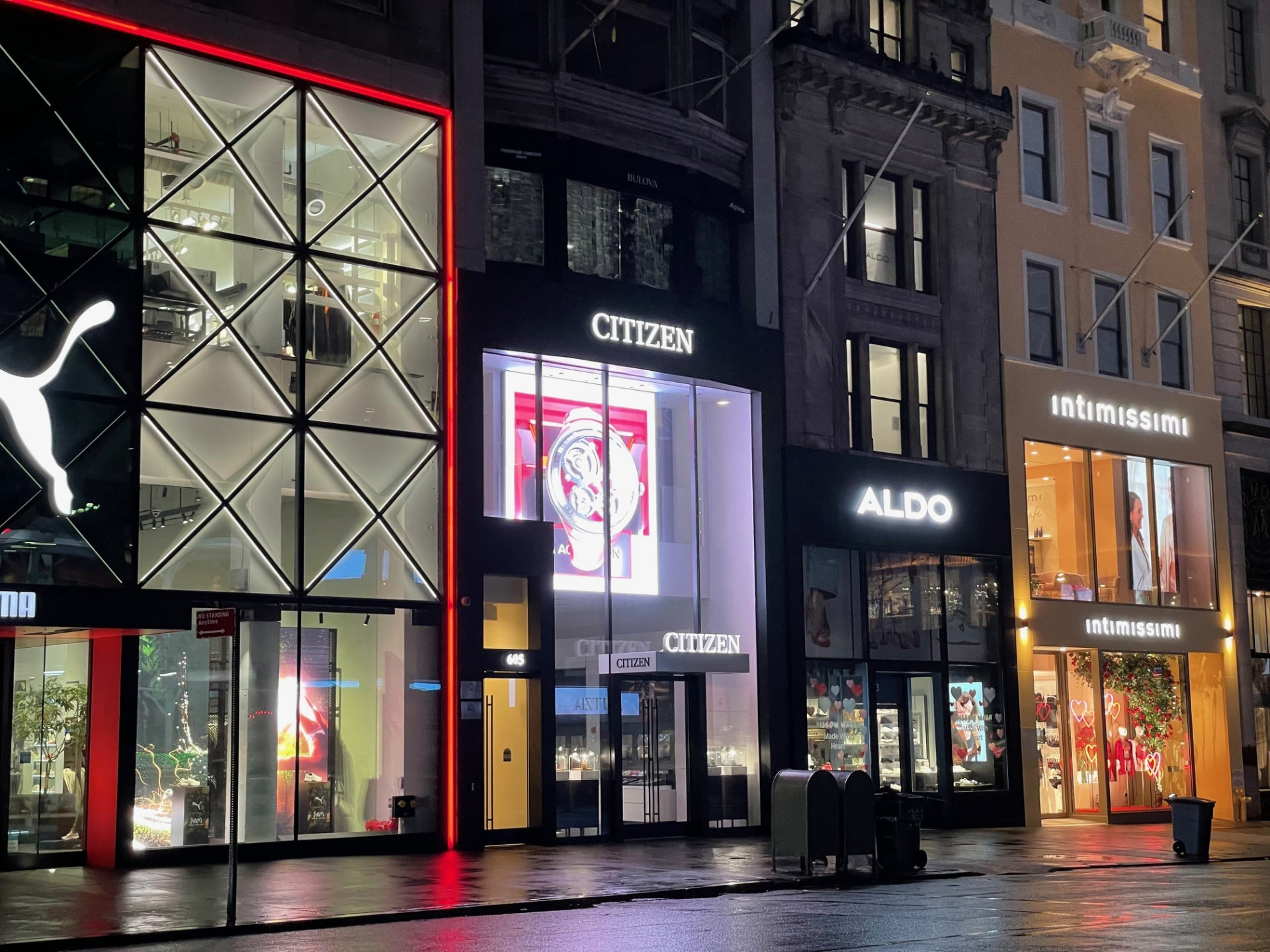
Leading an independently assembled creative team supporting Citizen Watch Group's retail and digital marketing initiatives across its retail network, including the New York City flagship.
Providing creative direction, brand stewardship and production oversight across in-store signage, campaign imagery, email marketing, print and digital collateral, and retail development communications.
A portfolio of distinct brands
Five watch brands, each with its own heritage, visual identity and audience. The creative challenge is to maintain those distinctions while delivering a consistent standard of execution across a shared retail and marketing ecosystem.





Brand experience, brought to life
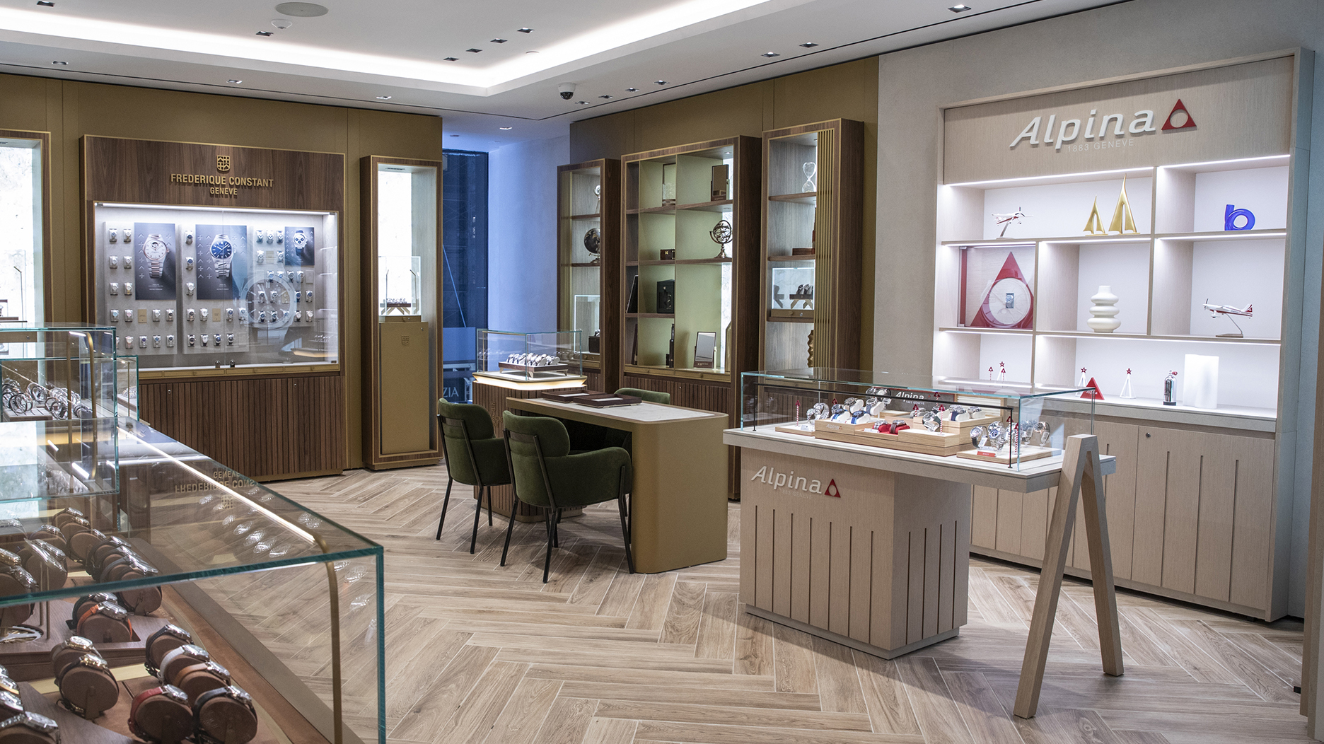
At the Citizen Watch Group flagship in New York City, individual brand identities come together within a single retail destination. The environment demonstrates how distinct brand expressions can coexist within a cohesive customer experience.
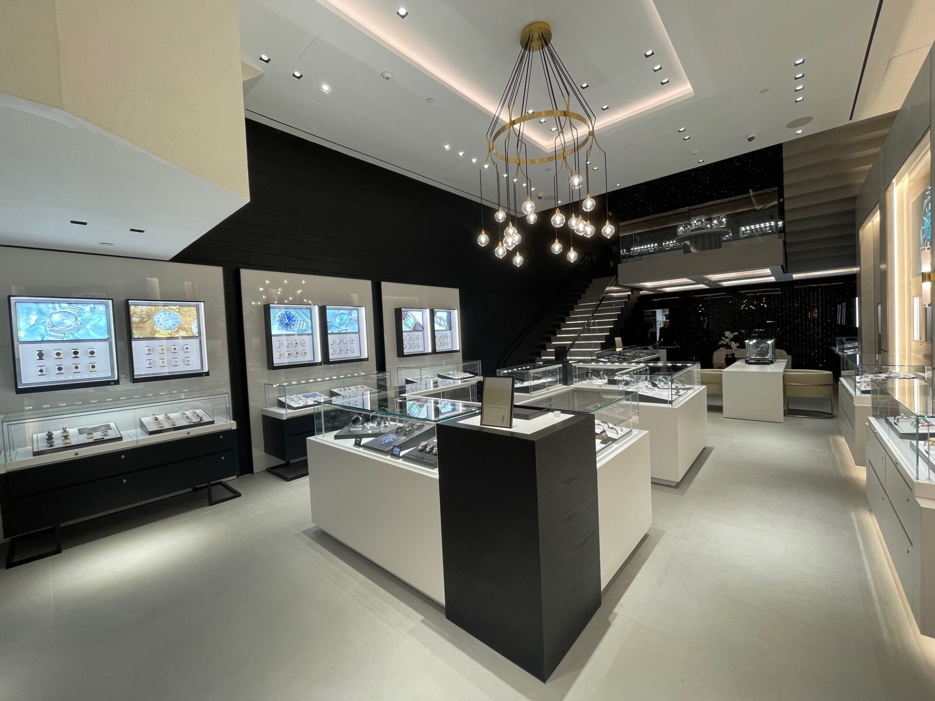
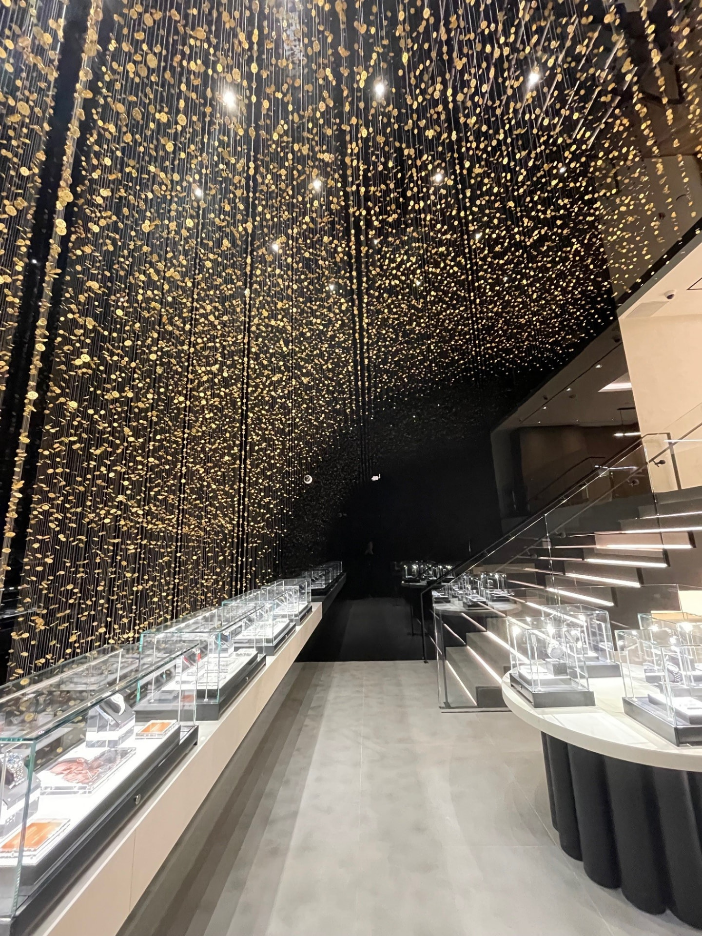
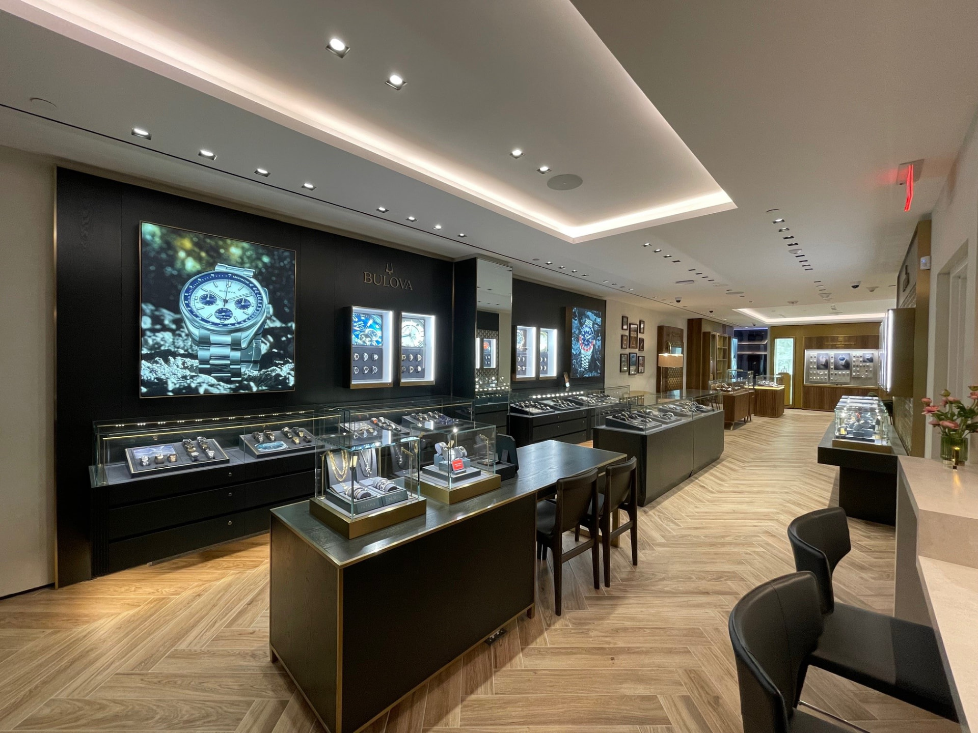

Light Is Time installation, designed by Tsuyoshi Tane in collaboration with CITIZEN.
The Creative Mandate
Supporting a growing retail and marketing network required more than individual creative executions. The challenge was to establish a dependable creative resource capable of translating product launches, merchandising priorities and marketing initiatives into consistent, high-quality communications across brands, channels and retail environments.
Building the Creative Model
I assembled and continue to lead a dedicated team of independent creative professionals, providing the creative direction, production oversight and brand stewardship needed to support Citizen's ongoing marketing and retail initiatives.
Establishing creative direction, maintaining visual consistency and translating business priorities into compelling brand communications.
Coordinating design and production across print, digital, retail signage, campaign imagery and email marketing.
Building and directing an independent team that adapts to changing project requirements while maintaining quality, continuity and responsiveness.
Creative Across Channels
From in-store environments to digital marketing, the work brings a consistent creative perspective to multiple customer touchpoints, adapting to the needs of each channel while maintaining the integrity of the Citizen brand.
Impact
Through an independently assembled and directed creative team, I have supported Citizen's retail and digital marketing programs across multiple markets, delivering a consistent stream of creative assets for stores, campaigns and customer communications.
The work contributes to a broader brand and retail ecosystem supporting customer engagement, traffic and sales performance.